DVSS - Day 1
Day 1 on the fly notes of MaLGa's Data Visualization Summer School 2025.
Scientific communication
- science != scientific literacy (content/research vs process/impact/methods)
- assess/know the scientific literacy level of the audience
Giorgia Lupi
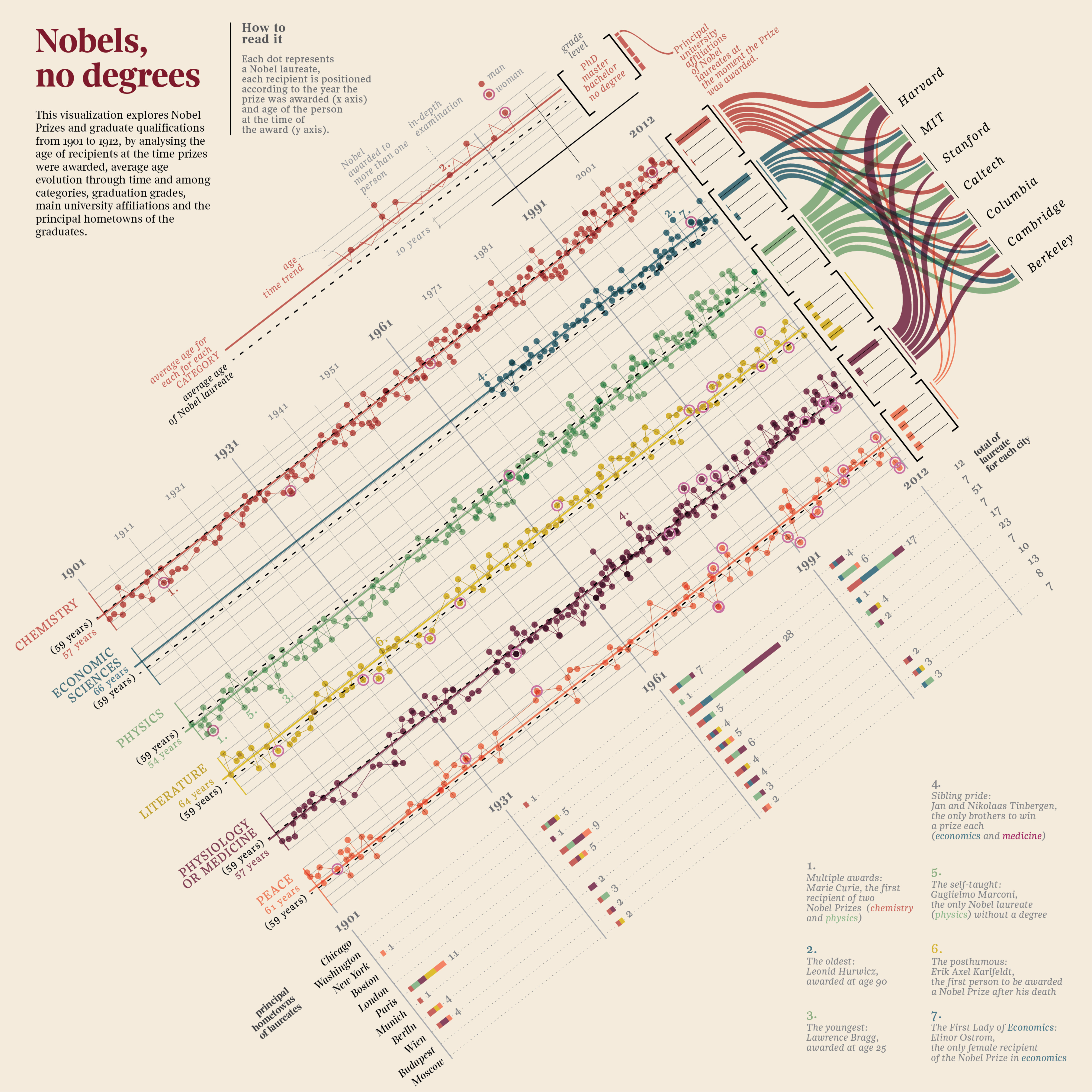
- peculiar use of space: chart diagonal orientation vs text lexicographic order, to convey information (e.g. "this should be read" vs "this should be seen") and to grab attention
- sample chart as legend
- Approximating the components of Lupi's Nobel, no degrees
Federica Fragapane
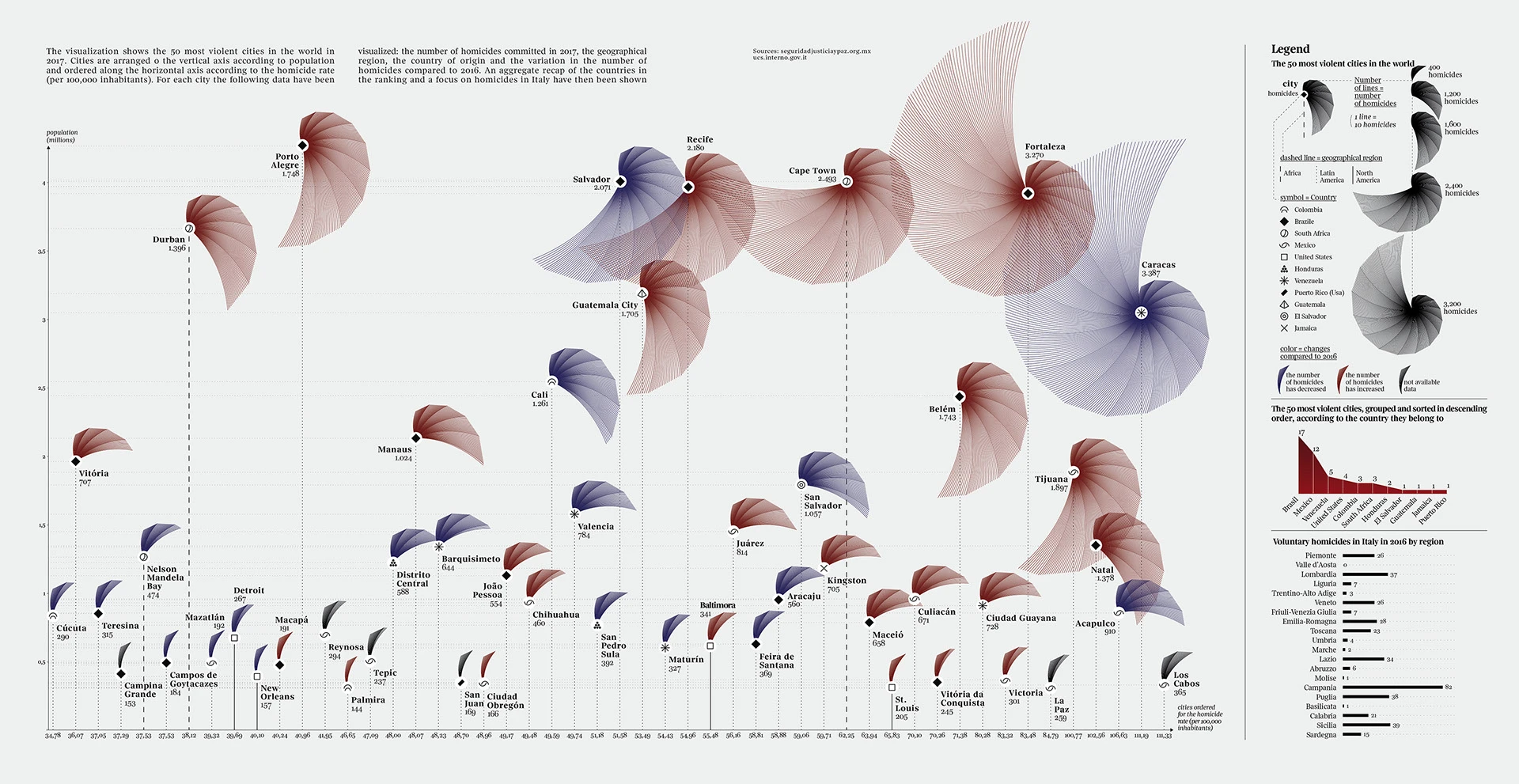
- lollipop chart with polar plot at each marker to convey both relative and absolute magnitude at the same time
- design choices to empathize with data meaning (e.g. encode murder victims as shell lines instead of radius amplitude)
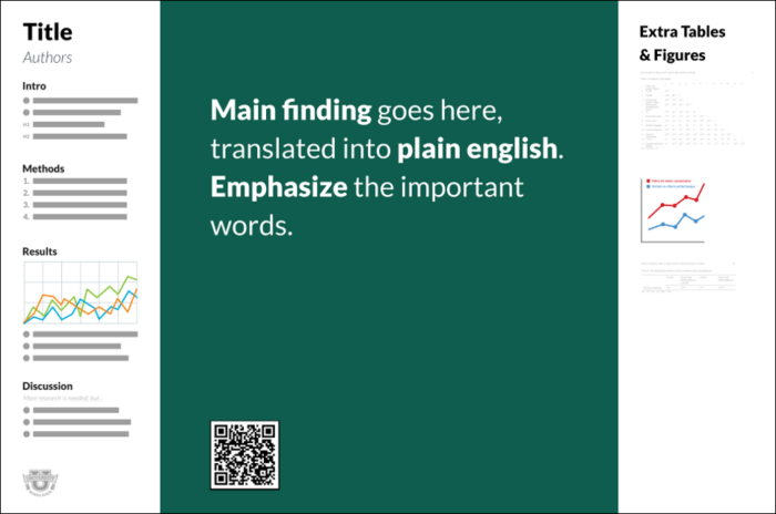
betterposter
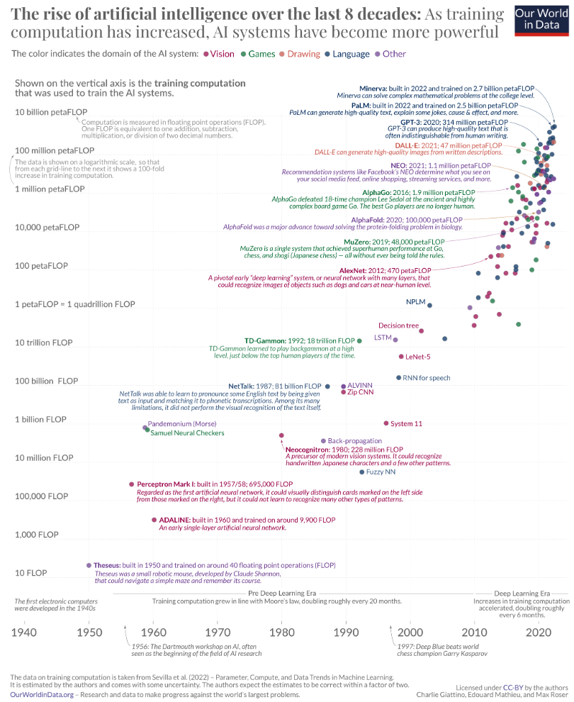
Our World In Data
Data Visualization
- Anscombe's quartet
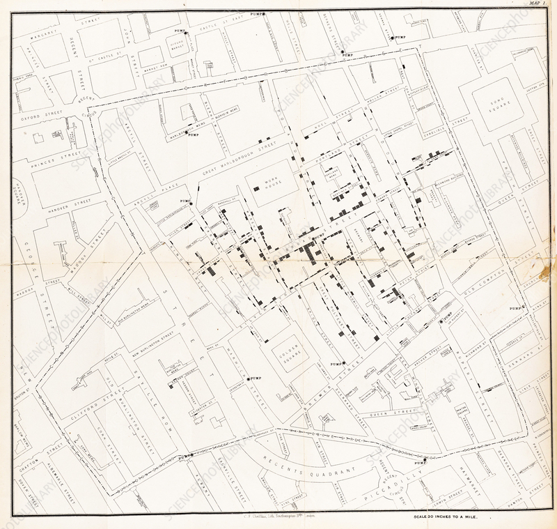
John Snow
Ed Hawkins

Guidelines for data viz
from "Better Data Visualization"
1. Show the data
- sometimes is enough (e.g. spatial data)
2. Reduce the clutter
- avoid useless visual elements (i.e. which don't convey additional information)
3. Integrate graphics and text
- legend can be placed close to data traces (ref. proximity)
- title, subtitle, text annotations
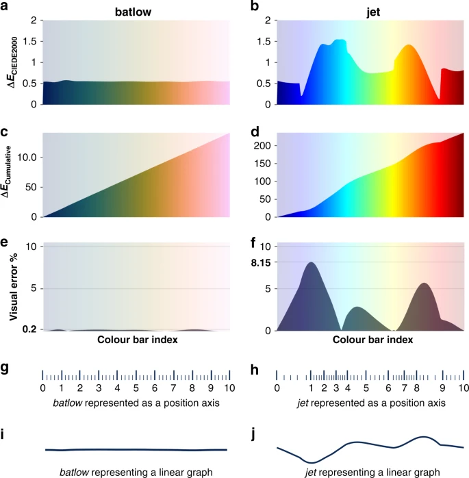
- choose an appropriate colormap (e.g. default
jetcolormap in Windy for temperature, which is not a gradient of anything) - The misuse of colour in science communication
- avoid inconsistencies (e.g. legend data sorted differently from data traces)
- add explainers (e.g. clearly state what the takeaway should be)
- chart-in-chart to explain details (zoom-in effect)
- explain how to read the graph
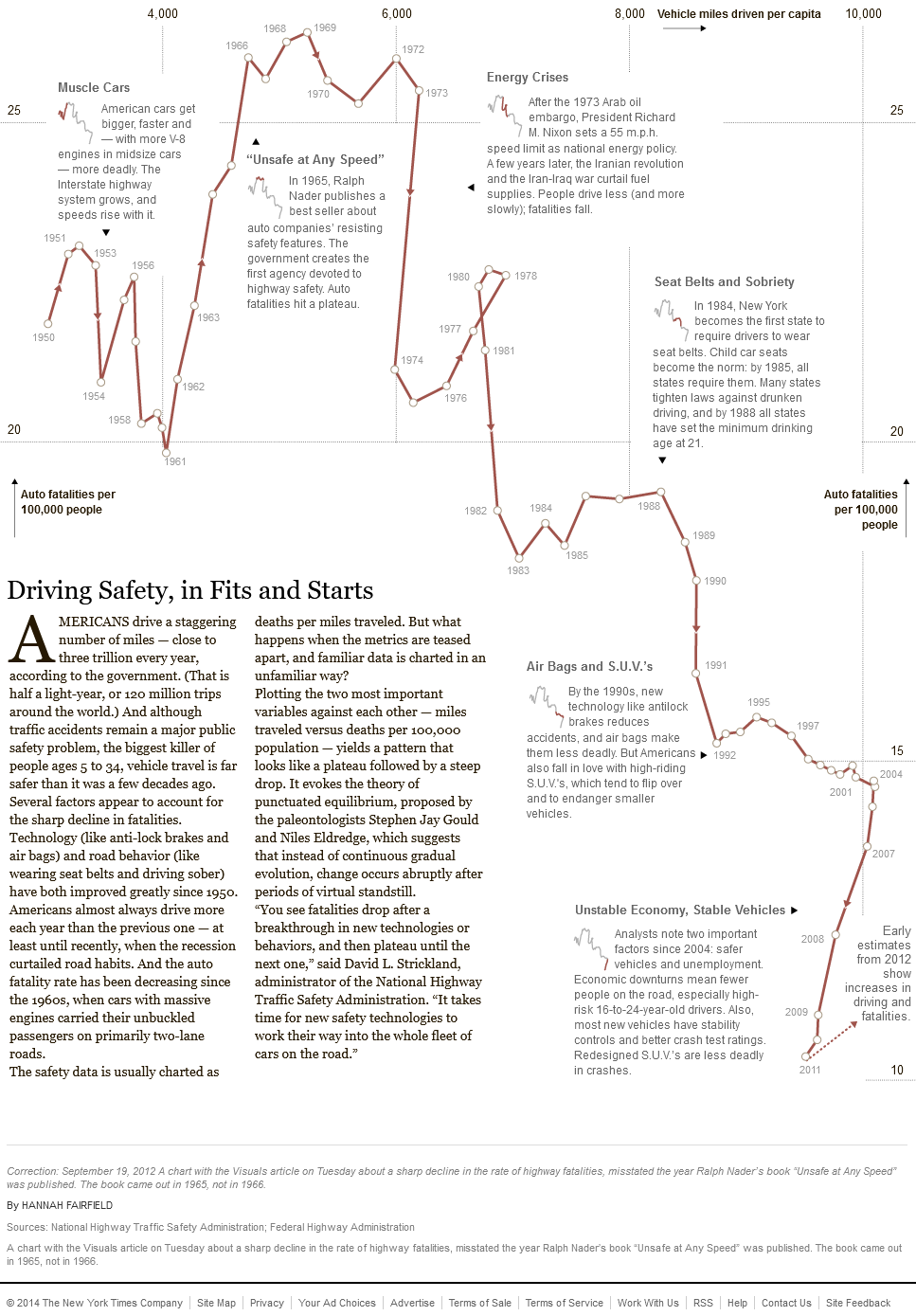
4. Avoid spaghetti charts
- multivariate data can be visualized as a collection of univariate charts (e.g. linecharts in a grid, with fixed axes ranges)
5. Start with gray
- start with everything in the background, and let emerge the important elements only
Visual perception and design principles
Gestalt principles
1. Proximity
- closeness
2. Similarity
- shapes
3. Closure
- tendency to perceive elements even if they are not visible
4. Common fate
- movement
5. Continuity
6. Good figure (Prägnanz)
- visual perception privilege simple and "good" shapes
7. Past experience
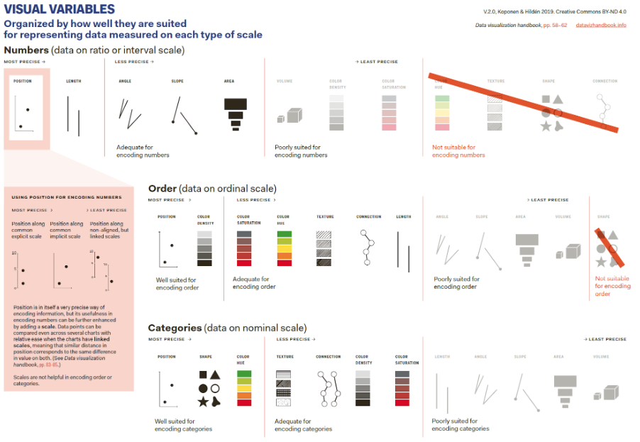
Encoding information